Showing posts with label korean. Show all posts

Monday, June 20, 2016

Blue Fire officially on Tapastic

First off, really sorry for the lack of updates.
Second, I've finally decided to upload the comic "Blue Fire" on Tapastic.

I plan on uploading a page from Monday to Friday of this week. That means 5 pages will be up and loaded. And I'm going to see how my update schedule works. I still find myself at a painstaking snail pace when it comes to making comics. I'm aiming for every 2 weeks for now. Maybe I can urge myself to create a page every week, once I leave my job. Otherwise, the updates would be sporadic. And that's not what I want.

In the mean time, I haven't updated with a whole lot of sketches or drawings. Most of the time I find really little to draw. And when I do, it's mainly fanart.
So I'll go ahead and upload what I have so far.

At one point there was a massive nation-wide internet blackout for Charter customers. Us included. So for a solid hour, me and my brother were perplexed, until we found that we weren't the only ones. Lots of upset baseball fans were unable to file complaints, since Charter's phone line was non-responsive. Using our phone data, we amused ourselves by reading all tweets related to Charter's blackout. Someone commented that Charter forgot to feed their hamsters. And that's how this doodle manifested.


And then there was mother's day.
My attempt of practicing the drawing of very detailed objects. My brother suggested drawing a simple Dreadnaught.
A card for Father's day.

Until then, I will do my best to update Blue Fire as much as possible.
Also, I finished animating part 1 of the Pixel Brains animated short. Still need 2 more parts.

Thursday, April 14, 2016

Lack of Update and slow progress on Blue Fire

It's been a really long time. I haven't been uploading any sketches or content, because all of my time has been devoted to the first pages of the first chapter of "Blue Fire".

I'm going through some personal conflict of wondering if comic/manhwa/manga making is something I'll stick with, or suited for. I've been so used to making fan-comics, that I wonder if I can really do this for the rest of my life. I'm thinking of trying some other small projects.

Beeswhacks still updating bi-weekly (every other week). Still working on that Pixel Brains short. Now I feel that I need to try and make at least one original sketch or drawing every week. At least something to put on my blog. It's been 2 months of inactivity, yet I post gratuitous fanart and sketches on my tumblr and occasionally my tumblr. In fact, I've been posting work-in-progress images of the "Blue Fire" pages on my instagram.

Also, a little update on why the Pixel Brains short is STILL taking too dang long.

Here's to hopefully more updates for the rest of this year.

Thursday, January 28, 2016

Blue Fire: Cover Test 2

I'm quite confident that "Blue Fire" will STAY as "Blue Fire."
As promised from the last post, I made another spread of cover/logo tests.
This time I made designs that include Hangul (Korean) text. 
However, after seeing feedback on my deviantart, I had to ask "what's the point of having a Korean-based title logo?"
There seemed to be no use, since my main audience understands English, and my Korean is abominable. Unless there are Korean viewers who want to take a stab at reading an English Manhwa, to brush up on their English skills.
I was surprised with one design, and loved it. 
So here it is. Again, feedback is appreciated. You can leave it here, my deviantart, or my tumblr.

Thursday, January 21, 2016

Blue Fire Cover Test and Really considering Title name change

First off, This is a cover test AND trying to figure out which title/logo looks best on the cover.
But now, I just thought of another design that I want to try: using a Korean title/logo, but integrating the smaller English title as part.
Sort of like this:

Ok this is the opposite of what I'm aiming for,
but this is the idea. Just reverse.

And of course, I saw how in some covers, the volume or chapter# is in a corner, or the title is at the bottom or on the side. Sometimes the author/artist name is in the corner or below the title. I don't know. That's how I ended up making a spread of covers for Blue Fire

It's quite frustrating when I can't choose my mind. I'm almost aiming for the first one, but I really liked the logos where the words were stacked.
But then again, I really need to make another design test for the Korean title logo.

And BIG BIG thanks to my parents for giving me feedback and making sense of my broken Konglish.
Expect another Cover/logo title test sometime next week.
^^

Wednesday, January 20, 2016

Blue FIre test page 3

And test page 3 is here.
This time I tested out my usual way of shading, and then tried with screentones on the right.
Now I remember why I don't like screentones.
They're meticulous.
So far, I think I'm fine for now. I'd really like to get thumbnails done, and at least figure out how to present this comic. I still haven't decided on the logo, and that needs to be done soon.
Not to mention, I have yet to finish thumbnailing the first chapter.


Monday, January 11, 2016

Blue Fire test page 2

Well, the one road block that got in my way, was the phantom's blue fiery eyes. I can't seem to draw fire well. Let alone in black and white. But my brother did offer good feedback on getting the flaming eye look by referring to the manga for "Black Rock Shooter." Really glad I looked at some references.

One thing's for sure, I definitely need to look up references for fight scenes, because the original crouching stance in the first panel was VERY unnatural. My brother couldn't pose that way for a reference picture. I couldn't keep that pose. So I ended up changing it. Now here, I've come up with 3 different tests. One is completely black and white, the middle emphasizes only blue fire, and the last is where the only color remaining is blue. Personally, I wonder if having one color out of the black and white is distracting.
What do you all think? I would love feedback.
You can send feedback on my deviantart or message me on tumblr
More test pages are coming, and I don't think the story needs too much tweaking.
I just need to get thumbnails out.

Friday, January 1, 2016

Here's to a productive 2016

Happy New Year's everyone.
And sorry about the lack of posts lately. December has not been fun, that I just didn't feel like updating due to the busy Holiday rush at work.
Now looking through 2015, I have to say...not too much has happened other than working retail. Oh wait! There is some.

  • I finished Sugar Dominion, the short one-shot manga
  • I opened my first webcomic Beeswhacks.
  • My right hand recovered from strain, and now those pains and weird clicking symptoms are back, so that I have to check up on.
  • Got a lot of progress on the fully animated short for Pixel Brains
  • Did my first internet drawing challenge: Drawlloween ^^
  • Made a few fanart and original pieces.
  • And have made lots of writing progress on my new comic, "Blue Fire" (title might be changed")
Now, there's a downside. I've definitely NOT accomplished 2015 new years' resolutions. But I do know this, I WILL make "Blue Fire" come to fruition. Eruti is still heavily on the backburner, due to how much I flip-flop with the direction of the plot, story, and theme. It's been difficult for me to grasp what my limits are, and what I'm more comfortable with. I've been slowly decaying spiritually. I think I've gotten too detached from God, that I've just stopped thinking He existed in my life. 

But enough of that, my hopes for the year of the monkey is DEFINITELY make "Blue Fire" a reality. This is one short story that I can make into a comic. Beeswhacks was a start, but now I'd rather start with something more short and simple. And hopefully I can finish animating that short for Pixel Brains. In other words, I want it to be a productive year. One that marks consistent progress. Who knows, I might have a patreon set up as well. That would be great. Also, I definitely want to be more faithful to God, and try to cast off my "religious" mask. That's all I've been, and I want to change that.

Now here's a taste of what Blue Fire is like. This is a test page, and I'm working on a 2nd one as well.


Ah and some sketches that I meant to upload


Thursday, November 26, 2015

Blue Fire: YeoungHy Character Color Test

This is probably the last character color test I'm going to do.
I really need to make thumbnails and start on pages, since the writing is done.


But it was still good to get an idea of what I wanted for the 2 main characters. Though I feel that the other characters need some more thought.
Now as I started working on YeoungHy, I came to this problem about her design; how do I draw slightly malnourished, yet strong females?
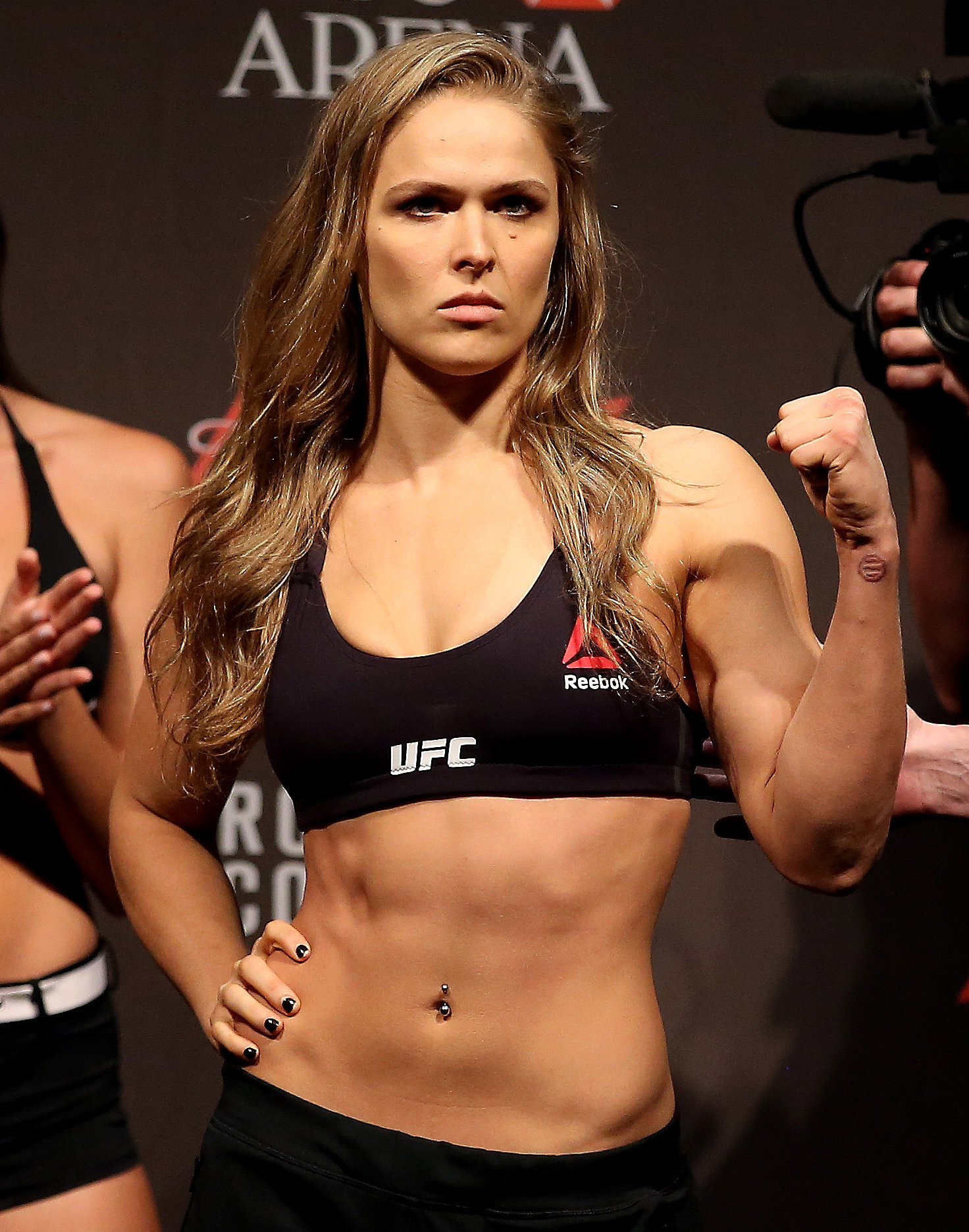
When it came time to sketch the body base for costumes, I decided that I wanted to give her a build close to MMA fighters, or the Korra build. While looking around the internet for perfectly athletic Asian women, I found that the Korra build may not work for YeoungHy.
so rather than the Korra build or the Ronda Rousey look

I went with this look. It looks sickly or meh, but I feel it's better for YeoungHy in her case. Well...actually I think I can combine a bit from both.
YeoungHy's family is not well off, so she probably doesn't eat as much. Even if she started to hunt to help feed her family, she still wouldn't be eating much.
YeoungHy is not only helping her family, but she's practically helping others. She's always active and moving, so she'd have muscles, but I feel she'd look more sickly, than healthy.
I just don't want to draw her with a slim figure.That's something I've always drawn. I want to challenge myself to draw a girl with some muscle on her.

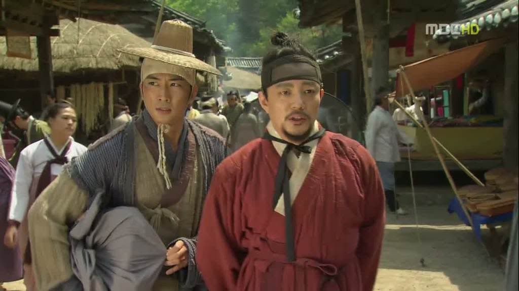
Also, some of the costumes don't look much like traditional hanbok. I got inspired by some of the costumes from "Jung Yi, Goddess of fire." Considering that most lower class civilians can barely afford to have colors. Most of them would wear only white or faded colors or earthy colors. So I was surprised that some costumes were colorful for peasants. Oh well. The great things about comics, I can bend a few rules.

Tuesday, November 24, 2015

Blue Fire Title Logo

I've been beating myself over getting the title look close to Korean calligraphy. Or even remotely like Asian calligraphy.
[EDIT/UPDATE]
I'm going to post new revisions on this post for the title.

Round 3 of new logo variations. [update 12/7]
This should be my last one


2nd batch of new logo variations
this was the first one.