Showing posts with label design. Show all posts

Thursday, November 26, 2015

Blue Fire: YeoungHy Character Color Test

This is probably the last character color test I'm going to do.
I really need to make thumbnails and start on pages, since the writing is done.


But it was still good to get an idea of what I wanted for the 2 main characters. Though I feel that the other characters need some more thought.
Now as I started working on YeoungHy, I came to this problem about her design; how do I draw slightly malnourished, yet strong females?
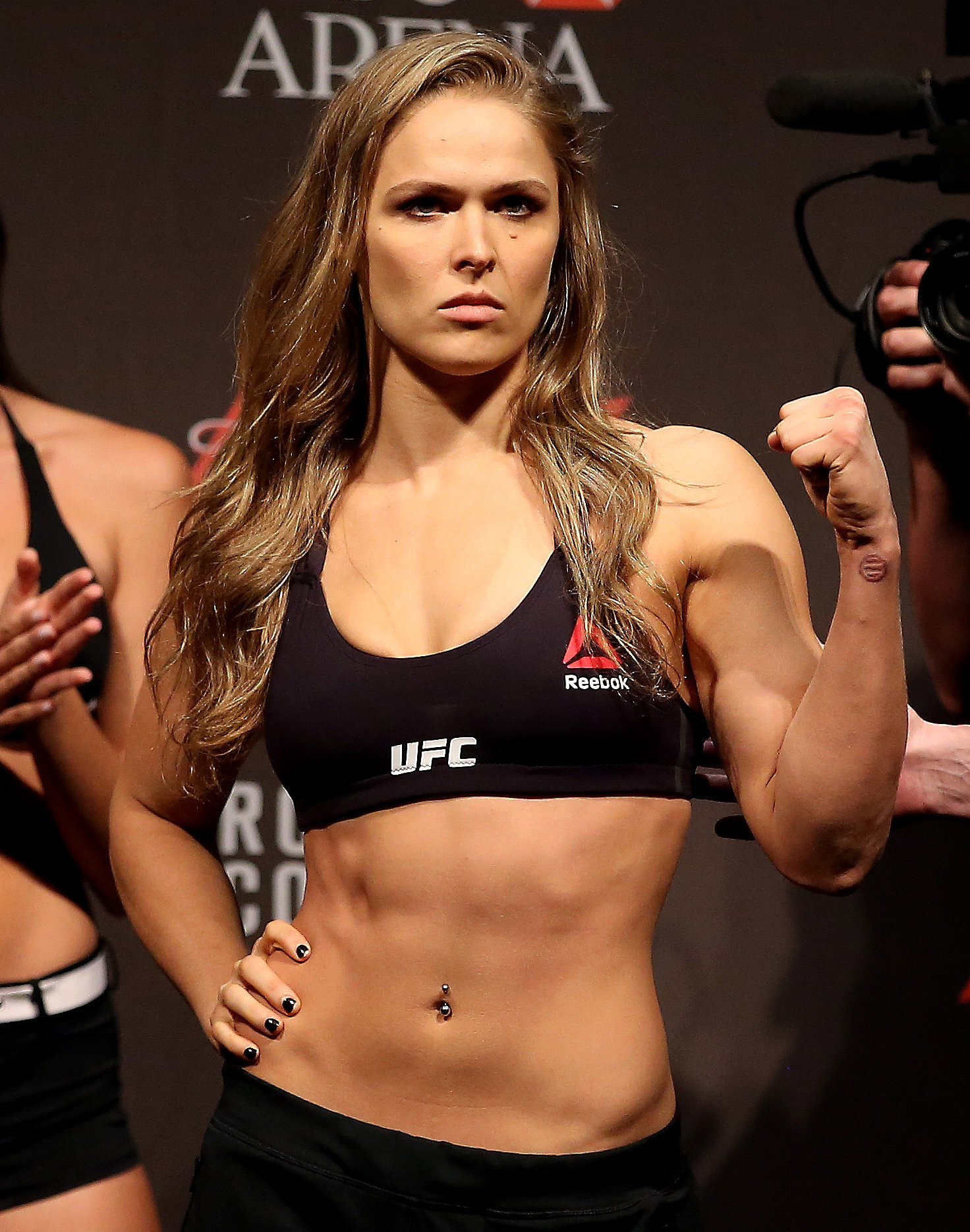
When it came time to sketch the body base for costumes, I decided that I wanted to give her a build close to MMA fighters, or the Korra build. While looking around the internet for perfectly athletic Asian women, I found that the Korra build may not work for YeoungHy.
so rather than the Korra build or the Ronda Rousey look

I went with this look. It looks sickly or meh, but I feel it's better for YeoungHy in her case. Well...actually I think I can combine a bit from both.
YeoungHy's family is not well off, so she probably doesn't eat as much. Even if she started to hunt to help feed her family, she still wouldn't be eating much.
YeoungHy is not only helping her family, but she's practically helping others. She's always active and moving, so she'd have muscles, but I feel she'd look more sickly, than healthy.
I just don't want to draw her with a slim figure.That's something I've always drawn. I want to challenge myself to draw a girl with some muscle on her.

Also, some of the costumes don't look much like traditional hanbok. I got inspired by some of the costumes from "Jung Yi, Goddess of fire." Considering that most lower class civilians can barely afford to have colors. Most of them would wear only white or faded colors or earthy colors. So I was surprised that some costumes were colorful for peasants. Oh well. The great things about comics, I can bend a few rules.

Tuesday, November 24, 2015

Blue Fire Title Logo

I've been beating myself over getting the title look close to Korean calligraphy. Or even remotely like Asian calligraphy.
[EDIT/UPDATE]
I'm going to post new revisions on this post for the title.

Round 3 of new logo variations. [update 12/7]
This should be my last one


2nd batch of new logo variations
this was the first one.


Thursday, November 19, 2015

Finished breaking down Blue Fire, and first character color test

Huzzah for productivity ^^
I've broken down chapters to pages, or estimated. I've got about 12 chapters to work with. Not bad. Few of them will be longer than the rest.
And I made my first color test, though I think I did it wrong.
Initially I'm used to drawing people or characters that are pleasing to look at. Well it was a challenge to remember that this character had a long shaggy beard, and looks like he's indifferent to his appearance. I'm glad I did a color test. Other wise he would have looked like an old, giant smurf.

My dad was intrigued with the fact that I was taking a Korean folk-tale and making it a manhwa comic. Sadly, even he had never heard of "The Logger's daughter and the Blue-eyed phantom." Not sure if this would be an authentic folk-tale. But that's okay. It gives me some freedom to make this "phantom" my own character on its own. And I'm really happy with where I'm going with the characters.

I'm planning on getting thumbnails, and doing a color test for YeoungHy, the logger's daughter.

Tuesday, April 27, 2010

Specialty item- final board

It's really better to look at the actual demo than the board, but it can't be helped.
I'm planning on embedding the actual demo here. But for now, see it on Deviantart
This is actually my final board. It's been quite overbearing, but fun in a bit.

Monday, April 26, 2010

Specialty item-progress

Sorry for not updating, I had another project that was due last Friday and integrated flash.
So far, I'm almost done, just a few bits of coding needed.
The website is quite interactive, so I have to make a flash demo. The menu have little icons float over them when the mouse is on top.
home page

product page
the picture that list the brands zooms up so you can get a good look at the product lines.


lessons page
The lessons page has its own menu for the different instruments taught

directions (in progress)


about us (in progress)

Friday, April 16, 2010

New Project- Specialty

I should've posted these beginning Monday
    My ideas were
  • Web site
  • t-shirt
  • custom picks
But I've decided to do a complete web site in Flash.

Wednesday, March 31, 2010

Ads-draft so far

After today's in-progress critique, I had a lot of feedback. Wish I were more productive to provide feedback for others. Originally I was struggling with type, but thanks to my instructor and helpful feedback, I think I've managed.


8"X10" 5"X5"


3"X10.5"

Wednesday, March 10, 2010

Mailer-prototype or diecuts

I tried making rough mock-ups of my ideas.
poster- to innovate the learning musician. And to promote music lessons.


this would be the front and how it would be mailed
about 4 cards in total. 3 note cards. I personally like this idea the most. It's more compact and petite, and convenient for music learners.

on the left is the inside. The Right is the info and the front card. I'll probably use sticker or glue dot to keep em folded during mailing.

Pamphlet
It will only be about 4 sheets, which isn't really worth stapling. This idea will be scrapped.

Tuesday, March 2, 2010

Project: Mailer-beggining thoughts, sketch, references

Now we move on to mailers. Since it's annoying having to make a new post for every new thing or thought I have, I'm going to update and existing post. This one for example.
    My ideas
  • pamphlet that informs about music lessons at Braswell Music, and also gives reasons why learning music is worth it.
  • poster, same reason as above. But the reasons for learning music would be the poster part. For motivation ^^.
  • -foldilocks-roll stack of cards that sums up the list of services and products available. You can tear the cards separately as notes. Each card has a quick  guide of the basic notes in a C major scale for the guitar (electric and bass) and the brass trumpet.
Sketches:
    Unfortunately I've become rather unimaginative, since I'm putting budget concern first.


    References or cool links:
    cool designs or inspirational 80% of em aren't really mailer -related -_-;
    brass trumpet fingering chart I might have to reconsider omitting the brass part in the key note idea
    bass guitar chart

    Monday, February 22, 2010

    Stationary-final look

    This is my stationary for my board. I had to make a horizontal envelope, since most envelopes are used this way. These are all actual sizes, didn't have to shrink them.

    Saturday, February 20, 2010

    Revised logo after critique

    Again my number one problem is tweaking the colors for inkjet printing, and the hierarchy of the lettering and colors. I don't know why I screw up badly at critiques. I said the wrong thing about my font, when I could've referred to the creative brief glued to the back of my board. So anyway, here's the original color logo unchanged, while I added grays to the b/w logo.
    Again, my concept around the logo was: free, music, casual, dynamic, friendly. The figure is the fun and energy in music, while the font is casual.

    Now here is one with the tweaked colors and a change in "Music". Someone suggested that I should try to spread the kerning between the letters to fit underneath "Braswell". I have yet to print this out yet, cuz my printer at home stinks and I don't trust it. The colors are respectfully Pantone 2995 U, Pantone Orange 021 U, Pantone 2985 U.
    Thoughts? Input? Is the change in "Music" necessary? I recall that someone suggested that I make Music look the fretboard of a guitar. But the problem with that: The flow of simplicity is broken. Truth be told, I liked it without the change (I definitely need the color changes though).

    Thursday, February 18, 2010

    Stationary ideas

    I should have put these up on Monday. Originally we had to come with 3 ideas for letterhead, envelope, and business card. Bellow are two die cuts. The first idea uses the rounded bottom die-cut, and the other two use the top die-cut.

    The first idea incorporates the 6 strings on a guitar. But this one isn't very successful so it's practically scrapped.

    2nd idea uses incorporates the dynamic free lines in the logo. I wanted a simple look.

    3rd idea uses watermark. Each piece has a different watermark. The colors are the same colors used in the logo, except desaturated.
    There's a good possibility that I might have to tweak the colors in my logo, because they come out faded on inkjet.

    Saturday, February 13, 2010

    Stationary project: sketches

    Truth be told, these were started last week. Eventually I built more ideas. Though I was disappointed with how little I came up with.
    Our requirements are:
    • letterhead
    • envelope
    • business card
    The first page is obviously a mess up. I realized that I was blindly diving in without much thought to the concept, and drawing individually didn't help.
    Then I decided to start over fresh on the next pages. This time I drew the set together to avoid confusion.

    Wednesday, February 3, 2010

    logo draft #3

    This is officially getting tiresome. I've got some good tips on revising again. When you look at the black logo, the text overpowers the drawing. So I had to add thicker strokes to balance out the heavy text. Interesting fact about printing is that I've learned where the Pantone colors are. Should save me some time when printing. Apparently lots of printers interpret certain CMYK colors differently, but it's not the case with pantone solid uncoated colors.
    OK I lied. THIS(below) is the final draft. I needed to create a continuous flow in the bottom of the legs. And I fit "Music" to be proportionate and more refined underneath the "well".

    Monday, February 1, 2010

    Logo draft 2-(hopefully the final)

    I've done some revisions to the guitar and smoothing out the lines. Personally I can't find any other way to improve here. If I added anything else, I'm afraid that it will kill the casual mood of the store. Feel free to comment and critique.