Monday, January 30, 2017

Game Portfolio-final colors for Dre9 & Inyuji

Like my previous post, I'm putting my concept designs here and on some other sites as well.
A little bit of backstory for these characters. In the near future, the world became altered and now there are pockets or zones that act like literal video game worlds. To live and survive in these "cyber" zones (looking for other names), P.A.V. Pals (Personal Anti-Virus) are created or assigned to fight against living "Viruses."

Dre9 wasn't designed by Inyuji. He was someone else's PAV Pal, until that owner passed away, leaving Dre9 in storage. And since Inyuji was initially broke & couldn't afford creating her own, she resorted to random selection.

For Dre9, I've chosen 5 color palettes that I really liked. So far my favorites are 3, & 5.
With Dre9 being a carefree, friendly, yet pragmatic A.I, a cool color scheme seemed to match well. But since he was originally someone ele's PAVPal, the color palette wouldn't necessarily match with Inyuji, unless it was coincidence.
 
Now for Inyuji (haha how egotistical of me), I was torn between having her color palette match closely to Dre9, or if I wanted some bit of contrast. 
  • Palette A: I didn't intend to swap her colors to pink and purple. It did wonders contrasting her from Dre9, but it didn't seem to fit her personality. Inyuji doesn't seem like a girl who likes pink and would be annoyed by it.
  • Palette B: the lower half would contrast with most of Dre9's color palettes. I can also write it off as an excuse for her having weird fashion tastes, & not having enough money to scrounge for the right outfit she wanted. After all, she tries her hardest to concentrate on her bare necessities.
  • Palette C: This is her initial, original design. The only way she'd contrast is if Dre9 wore palettes 1,2, & 4. On the other hand, Inyuji might prefer to have an PAV Pal that has a slightly matching color scheme as her. 
So now that begs the question, which one looks best on Dre9? Should he match with Inyuji? Or should they contrast? Which color pairing looks best?

Monday, January 23, 2017

New Portfolio-character design wip

It seems that I'm going to be stuck with character design for a while before I go to other prop design or background art.
However, I find myself in a pickle.
One character, I've already got his design down. Just gotta pick a darn color scheme that works.
Another character, I'm pondering if I should change up her outfit.
Perhaps you can help me?
First is Dre9 (temporary name)-Dre is practically a living AI companion/assistant. The world is basically sprinkled with parts of the world that have blended in with the digital world/cyperspace. I have about 4 favorite color schemes, but want to know which one works best.

And then there's my "Inyuji" persona, but I'm thinking of renaming her. This was her first initial design, which is based on my current icon avatar
Now here are the alternative sketches

Which one is better? Please leave comments below.

Sunday, January 1, 2017

Happy New Year 2017-reflections, plans, & sketches

Happy New Year it is finally 2017. Goodbye 2016.
2016 was a crazy year, a hard year, but albeit a productive year for me.
So here are some highlights of 2016 (cuz I don't want to think of how many musicians and good actors/actresses died)
  • I finally finished the Pixel Brains animated short for L4D2
  • I launched my webcomic "Blue Fire"
  • I finished my storyboard portfolio (which I kept holding off for a few years)
  • Started making comics for a local newspaper
  • Dusted out my youtube channel
  • Actually took on commissions
  • Set up a Patreon
Now for my resolutions:
  • Create a concept art portfolio centered on game development
  • Make Youtube an actual job as an artist/animator
  • try to finish some animated short projects
  • continue working on "Blue Fire" & upload it on Webtoons along side other platforms
  • Be more patient & willing to trust God & stop trying to control every facet of my life, because the universe bows to no one & I'm a sinle speck of dust in this cosmic ocean
  • If Youtube doesn't work out, look into enrolling into technical college to gain skills that will get me a normal job
  • And if I'm unable to afford college, actually search for a job after the summer.
I'm happy to say that I found it pretty fun to work on commissions, no matter how small they were. Really thankful to some of the people who commissioned me. Here are samples:  
The last comic of 2016 for the "Korean Baptist Press of the USA" 침례신문
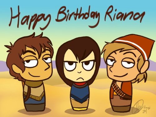
A piece of fanart for Riana Dorsey, cuz it was her birthday. If you can, check out her webcomic "Suihira." It's great ^^
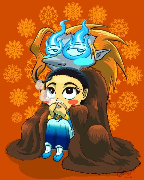
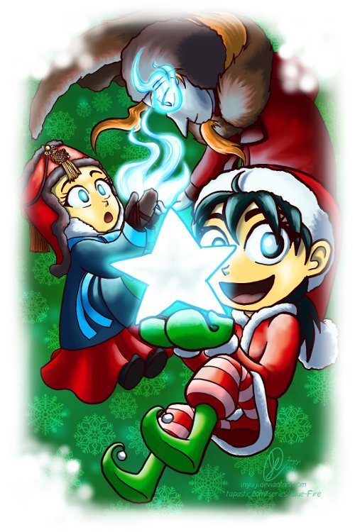
And some art for Blue Fire
To spruce up my youtube page, I made myself a whole new channel art, which is now one of my wallpapers:

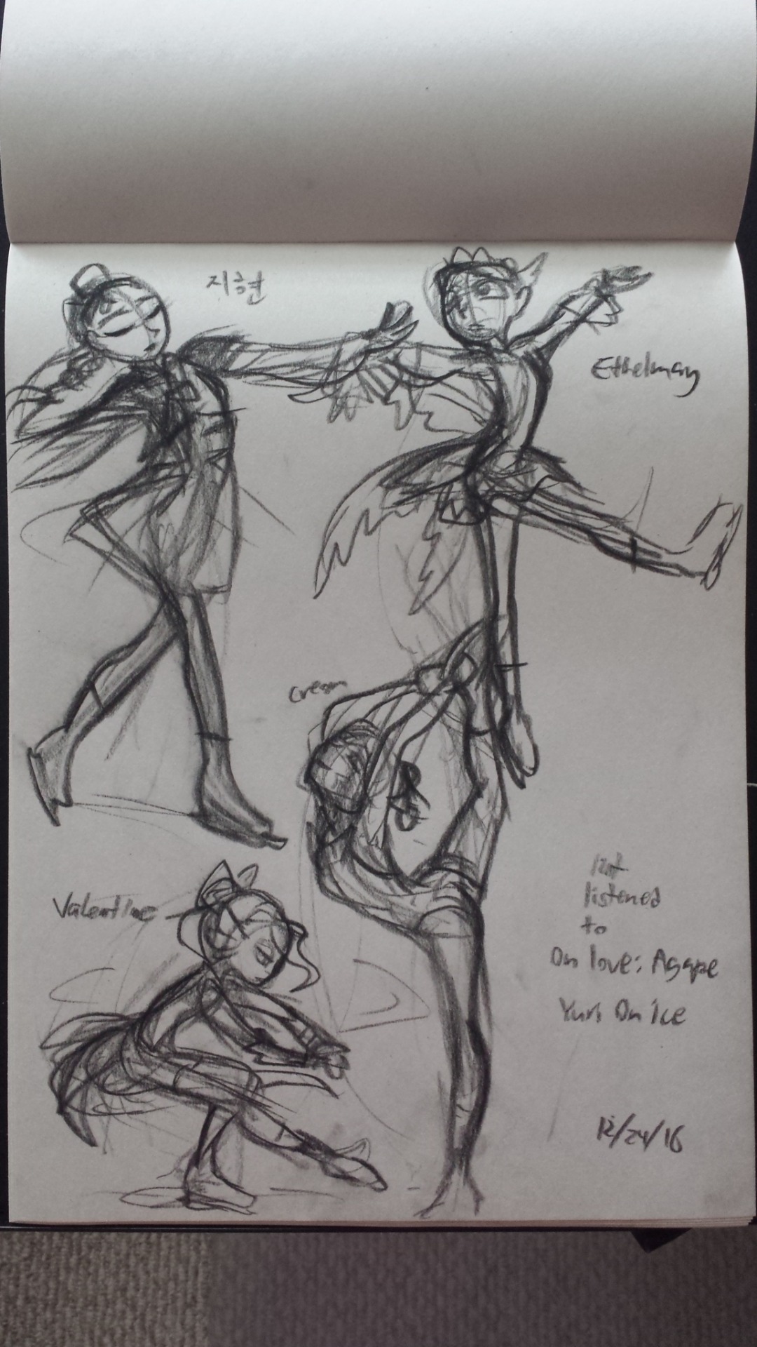
I'm now a fan of "Yuri!! On ice" anime. So good. And because of constantly listening to the song "On love: Agape," I sketched some of my characters as figure skaters. There's Ji-Hyun from that scrapped "Phantom of the Opera" fancomic. Her outfit is based on a Korean doll. Ethelmay from Eruti, her design is fairy-based. Creon is a simple one piece that shows off the markings on her skin (just didn't color them here since it was all charcoal). And Valentine in a stylized outfit based on a swallowtail tuxedo.
And that's about it. Happy new year, and best of luck to you all. God bless you all and take care.